『物理』量測『輻射』之『通量』︰
Radiometry
Radiometry is a set of techniques for measuring electromagnetic radiation, including visible light. Radiometric techniques in optics characterize the distribution of the radiation’s power in space, as opposed to photometric techniques, which characterize the light’s interaction with the human eye. Radiometry is distinct from quantum techniques such as photon counting.
The use of radiometers to determine the temperature of objects and gasses by measuring radiation flux is called pyrometry. Handheld pyrometer devices are often marketed as infrared thermometers.
Radiometry is important in astronomy, especially radio astronomy, and plays a significant role in Earth remote sensing. The measurement techniques categorized as radiometry in optics are called photometry in some astronomical applications, contrary to the optics usage of the term.
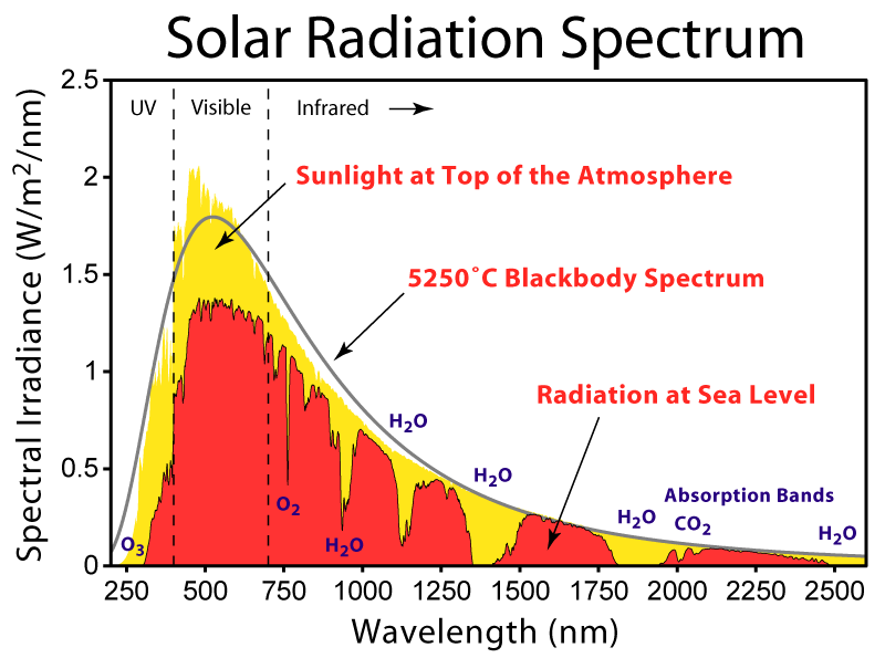
Spectroradiometry is the measurement of absolute radiometric quantities in narrow bands of wavelength.[1]
不同於『人眼』所見『光度』的『明暗』︰
Photometry (optics)
Photometry is the science of the measurement of light, in terms of its perceived brightness to the human eye.[1] It is distinct from radiometry, which is the science of measurement of radiant energy (including light) in terms of absolute power. In modern photometry, the radiant power at each wavelength is weighted by a luminosity function that models human brightness sensitivity. Typically, this weighting function is the photopic sensitivity function, although the scotopic function or other functions may also be applied in the same way.
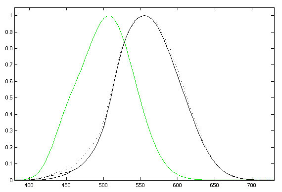
Photopic (daytime-adapted, black curve) and scotopic [1] (darkness-adapted, green curve) luminosity functions. The photopic includes the CIE 1931 standard [2] (solid), the Judd-Vos 1978 modified data [3] (dashed), and the Sharpe, Stockman, Jagla & Jägle 2005 data [4] (dotted). The horizontal axis is wavelength in nm.
因此『物理量』非與『感知度』成比例,故而『客觀』逢『主觀』耶?所以『色彩』不得不依賴『比色法』
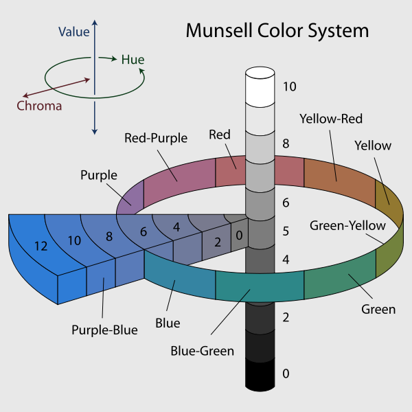
色度學
色度學(Colorimetry),又名比色法,是量化和物理上描述人們顏色知覺的科學和技術。 色度學同光譜學(spectrophotometry)相近 ,但是色度學更關心的是於人們顏色知覺物理相關的光譜。最常用的是CIE1931色彩空間和相關的數值。
乎!如果說『無色彩』之『灰階』︰
Grayscale
In photography and computing, a grayscale or greyscale digital image is an image in which the value of each pixel is a single sample, that is, it carries only intensity information. Images of this sort, also known as black-and-white, are composed exclusively of shades of gray, varying from black at the weakest intensity to white at the strongest.[1]
Grayscale images are distinct from one-bit bi-tonal black-and-white images, which in the context of computer imaging are images with only two colors, black and white (also called bilevel or binary images). Grayscale images have many shades of gray in between.
Grayscale images are often the result of measuring the intensity of light at each pixel in a single band of the electromagnetic spectrum (e.g. infrared, visible light, ultraviolet, etc.), and in such cases they are monochromatic proper when only a given frequency is captured. But also they can be synthesized from a full color image; see the section about converting to grayscale.
Numerical representations

A sample grayscale image
The intensity of a pixel is expressed within a given range between a minimum and a maximum, inclusive. This range is represented in an abstract way as a range from 0 (total absence, black) and 1 (total presence, white), with any fractional values in between. This notation is used in academic papers, but this does not define what “black” or “white” is in terms of colorimetry.
Another convention is to employ percentages, so the scale is then from 0% to 100%. This is used for a more intuitive approach, but if only integer values are used, the range encompasses a total of only 101 intensities, which are insufficient to represent a broad gradient of grays. Also, the percentile notation is used in printing to denote how much ink is employed in halftoning, but then the scale is reversed, being 0% the paper white (no ink) and 100% a solid black (full ink).
In computing, although the grayscale can be computed through rational numbers, image pixels are stored in binary, quantized form. Some early grayscale monitors can only show up to sixteen (4-bit) different shades, but today grayscale images (as photographs) intended for visual display (both on screen and printed) are commonly stored with 8 bits per sampled pixel, which allows 256 different intensities (i.e., shades of gray) to be recorded, typically on a non-linear scale. The precision provided by this format is barely sufficient to avoid visible banding artifacts, but very convenient for programming because a single pixel then occupies a single byte.
Technical uses (e.g. in medical imaging or remote sensing applications) often require more levels, to make full use of the sensor accuracy (typically 10 or 12 bits per sample) and to guard against roundoff errors in computations. Sixteen bits per sample (65,536 levels) is a convenient choice for such uses, as computers manage 16-bit words efficiently. The TIFF and the PNG (among other) image file formats support 16-bit grayscale natively, although browsers and many imaging programs tend to ignore the low order 8 bits of each pixel.
No matter what pixel depth is used, the binary representations assume that 0 is black and the maximum value (255 at 8 bpp, 65,535 at 16 bpp, etc.) is white, if not otherwise noted.
也得和『採色、顯色裝置』相干︰
Converting color to grayscale
Conversion of a color image to grayscale is not unique; different weighting of the color channels effectively represent the effect of shooting black-and-white film with different-colored photographic filters on the cameras.
Colorimetric (luminance-preserving) conversion to grayscale
A common strategy is to use the principles of photometry or, more broadly, colorimetry to match the luminance of the grayscale image to the luminance of the original color image.[2][3] This also ensures that both images will have the same absolute luminance, as can be measured in its SI units of candelas per square meter, in any given area of the image, given equal whitepoints. In addition, matching luminance provides matching perceptual lightness measures, such as L* (as in the 1976 CIE Lab color space) which is determined by the linear luminance Y (as in the CIE 1931 XYZ color space) which we will refer to here as Ylinear to avoid any ambiguity.
To convert a color from a colorspace based on an RGB color model to a grayscale representation of its luminance, weighted sums must be calculated in a linear RGB space, that is, after the gamma compression function has been removed first via gamma expansion.[4]
For the sRGB color space, gamma expansion is defined as

where Csrgb represents any of the three gamma-compressed sRGB primaries (Rsrgb, Gsrgb, and Bsrgb, each in range [0,1]) and Clinear is the corresponding linear-intensity value (Rlinear, Glinear, and Blinear, also in range [0,1]). Then, linear luminance is calculated as a weighted sum of the three linear-intensity values. The sRGB color space is defined in terms of the CIE 1931 linear luminance Ylinear, which is given by
-
.[5]
The coefficients represent the measured intensity perception of typical trichromat humans, depending on the primaries being used; in particular, human vision is most sensitive to green and least sensitive to blue. To encode grayscale intensity in linear RGB, each of the three primaries can be set to equal the calculated linear luminance Y (replacing R,G,B by Y,Y,Y to get this linear grayscale). Linear luminance typically needs to be gamma compressed to get back to a conventional non-linear representation. For sRGB, each of its three primaries is then set to the same gamma-compressed Ysrgb given by the inverse of the gamma expansion above as

In practice, because the three sRGB components are then equal, it is only necessary to store these values once in sRGB-compatible image formats that support a single-channel representation. Web browsers and other software that recognizes sRGB images will typically produce the same rendering for such a grayscale image as it would for an sRGB image having the same values in all three color channels.
能不叫人頭疼嗎??若講現代『顯示器』基本符合『sRGB』標準,不知『ColorPy』程式庫之『色彩空間』以及『裝置假設』人
《ColorPy/colorpy/colormodels.py》
colormodels.py – Conversions between color models
Description:
Defines several color models, and conversions between them.
The models are:
xyz – CIE XYZ color space, based on the 1931 matching functions for a 2 degree field of view.
Spectra are converted to xyz color values by integrating with the matching functions in ciexyz.py.
xyz colors are often handled as absolute values, conventionally written with uppercase letters XYZ, or as scaled values (so that X+Y+Z = 1.0), conventionally written with lowercase letters xyz.
This is the fundamental color model around which all others are based.
rgb – Colors expressed as red, green and blue values, in the nominal range 0.0 – 1.0. These are linear color values, meaning that doubling the number implies a doubling of the light intensity. rgb color values may be out of range (greater than 1.0, or negative), and do not account for gamma correction. They should not be drawn directly.
irgb – Displayable color values expressed as red, green and blue values, in the range 0 – 255. These have been adjusted for gamma correction, and have been clipped into the displayable range 0 – 255.
These color values can be drawn directly.
Luv – A nearly perceptually uniform color space.
Lab – Another nearly perceptually uniform color space.
As far as I know, the Luv and Lab spaces are of similar quality.
Neither is perfect, so perhaps try each, and see what works best for your application.
The models store color values as 3-element NumPy vectors.
The values are stored as floats, except for irgb, which are stored as integers.
將要如何『解讀』程式『輸出』呢??
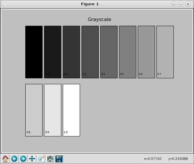
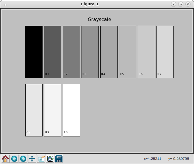
pi@raspberrypi:~ipython3 --pylab Python 3.4.2 (default, Oct 19 2014, 13:31:11) Type "copyright", "credits" or "license" for more information. IPython 2.3.0 -- An enhanced Interactive Python. ? -> Introduction and overview of IPython's features. %quickref -> Quick reference. help -> Python's own help system. object? -> Details about 'object', use 'object??' for extra details. Using matplotlib backend: TkAgg In [1]: import colorpy.misc In [2]: 線性編碼灰階 = ['#000000', '#1A1A1A', '#333333', '#4D4D4D', '#666666', '#808080', '#999999', '#B3B3B3', '#CCCCCC', '#E6E6E6', '#FFFFFF'] In [3]: 線性編碼灰階級 = ['0.0', '0.1', '0.2', '0.3', '0.4', '0.5', '0.6', '0.7', '0.8', '0.9', '1.0'] In [4]: colorpy.misc.colorstring_patch_plot (線性編碼灰階, 線性編碼灰階級, 'Grayscale', 'grayscale', num_across=8) Saving plot grayscale In [5]: 線性強度灰階 = ['#000000', '#5A5A5A', '#7B7B7B', '#949494', '#A9A9A9', '#BBBBBB', '#CBCBCB', '#D9D9D9', '#E7E7E7', '#F4F4F4', '#FFFFFF'] In [6]: 線性強度灰階級 = 線性編碼灰階級 In [7]: colorpy.misc.colorstring_patch_plot (線性強度灰階, 線性強度灰階級, 'Grayscale', 'grayscale', num_across=8) Saving plot grayscale In [8]:
【 Linear encoding 】
【 Linear intensity 】
On most displays (those with gamma of about 2.2), one can observe that the linear-intensity scale has a large jump in perceived brightness between the intensity values 0.0 and 0.1, while the steps at the higher end of the scale are hardly perceptible. The gamma-encoded scale, which has a nonlinearly-increasing intensity, will show much more even steps in perceived brightness.
A cathode ray tube (CRT), for example, converts a video signal to light in a nonlinear way, because the electron gun’s intensity (brightness) as a function of applied video voltage is nonlinear. The light intensity I is related to the source voltage Vs according to

where γ is the Greek letter gamma. For a CRT, the gamma that relates brightness to voltage is usually in the range 2.35 to 2.55; video look-up tables in computers usually adjust the system gamma to the range 1.8 to 2.2,[1] which is in the region that makes a uniform encoding difference give approximately uniform perceptual brightness difference, as illustrated in the diagram at the top of this section.
For simplicity, consider the example of a monochrome CRT. In this case, when a video signal of 0.5 (representing mid-gray) is fed to the display, the intensity or brightness is about 0.22 (resulting in a dark gray). Pure black (0.0) and pure white (1.0) are the only shades that are unaffected by gamma.
To compensate for this effect, the inverse transfer function (gamma correction) is sometimes applied to the video signal so that the end-to-end response is linear. In other words, the transmitted signal is deliberately distorted so that, after it has been distorted again by the display device, the viewer sees the correct brightness. The inverse of the function above is:

where Vc is the corrected voltage and Vs is the source voltage, for example from an image sensor that converts photocharge linearly to a voltage. In our CRT example 1/γ is 1/2.2 or 0.45.
A color CRT receives three video signals (red, green and blue) and in general each color has its own value of gamma, denoted γR, γG or γB. However, in simple display systems, a single value of γ is used for all three colors.
Other display devices have different values of gamma: for example, a Game Boy Advance display has a gamma between 3 and 4 depending on lighting conditions. In LCDs such as those on laptop computers, the relation between the signal voltage Vs and the intensity I is very nonlinear and cannot be described with gamma value. However, such displays apply a correction onto the signal voltage in order to approximately get a standard γ = 2.5 behavior. In NTSC television recording, γ = 2.2.
The power-law function, or its inverse, has a slope of infinity at zero. This leads to problems in converting from and to a gamma colorspace. For this reason most formally defined colorspaces such as sRGB will define a straight-line segment near zero and add raising x + K (where K is a constant) to a power so the curve has continuous slope. This straight line does not represent what the CRT does, but does make the rest of the curve more closely match the effect of ambient light on the CRT. In such expressions the exponent is not the gamma; for instance, the sRGB function uses a power of 2.4 in it, but more closely resembles a power-law function with an exponent of 2.2, without a linear portion.
誠所見或不同,知之者明矣☆
Simple monitor tests

To see whether one’s computer monitor is properly hardware adjusted and can display shadow detail in sRGB images properly, they should see the left half of the circle in the large black square very faintly but the right half should be clearly visible. If not, one can adjust their monitor’s contrast and/or brightness setting. This alters the monitor’s perceived gamma. The image is best viewed against a black background.
This procedure is not suitable for calibrating or print-proofing a monitor. It can be useful for making a monitor display sRGB images approximately correctly, on systems in which profiles are not used (for example, the Firefox browser prior to version 3.0 and many others) or in systems that assume untagged source images are in the sRGB colorspace.
On some operating systems running the X Window System, one can set the gamma correction factor (applied to the existing gamma value) by issuing the command xgamma -gamma 0.9 for setting gamma correction factor to 0.9, and xgamma for querying current value of that factor (the default is 1.0). In OS X systems, the gamma and other related screen calibrations are made through the System Preferences. Microsoft Windows versions before Windows Vista lack a first-party developed calibration tool.
In the test pattern to the right, the linear intensity of each solid bar is the average of the linear intensities in the surrounding striped dither; therefore, ideally, the solid squares and the dithers should appear equally bright in a properly adjusted sRGB system.
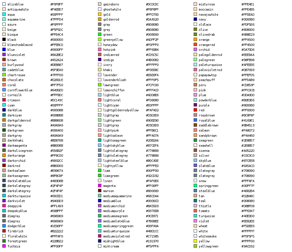
顏色列表
此列表僅列出常見的色彩,色彩的多樣性使得在實際上難以全部列舉或命名。另外由於各種顯示器在未經校正前有色差存在,因此以下的色彩呈現僅供參考。


 時,人感覺不到
  ,就可將上式寫成︰
 『表述』實優於
 ,能產生互斥『結果』
  的『彩票』
的『彩票』  表示成︰
表示成︰ 。
。 ,
, ,或
,或 
 』
』 ,而且
,而且  ,那麼
,那麼  。
。 , 那麼存在一個『機率』
![p\in[0,1]](http://www.freesandal.org/wp-content/ql-cache/quicklatex.com-cd99876237a78fec45ef2ec4cc909f44_l3.png "Rendered by QuickLaTeX.com") ,使得
,使得  。
。 與『機率』
與『機率』 ![p\in(0,1]](http://www.freesandal.org/wp-content/ql-cache/quicklatex.com-2de5bbe9671b75f59e6027e3063c85ec_l3.png "Rendered by QuickLaTeX.com") ,滿足
,滿足  。
。 ,使得
,使得  ,而且對任意兩張『彩票』,如果
  。此處
。此處  代表對
代表對  ,符合
,符合 。
。
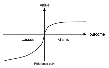
 是『價值函數』 value function ,表示不同可能結果,在決策者心中的『相對價值』。而
  是『機會權重函數』 probability weighting function ,藉此表現通常人對於『極不可能』發生的事,往往會『過度反應』 over-react,而對『高度可能』出現的事,常常又會『反應不及』 under-react。從而形成一條穿過『參考點』的『S 型曲線』。那個
  就是一個人在作『得失決策』時的『總體評估』,或者說『預期效用』。